Tips on Pairing Two Fonts for Web Design
Pairing fonts that complement one another is an essential process of any web design. The right font pairing ensures your page flows nicely, gives off an attractive design, and delivers a pleasant reader experience. Choosing fonts that complement one another for web design can mean the difference between a compelling, professional design and a lifeless one. However, font pairing can be confusing for most people.
Pairing two fonts for web design can be challenging, but it’s also an opportunity to add depth and personality to your design. It’s essential to start with a clear understanding of the purpose and tone of the procedure for creating a successful font pairing. Choosing fonts that complement each other and convey the right mood can be achieved by selecting fonts with contrasting weights, styles, or proportions. Many San Francisco web design companies consider legibility and readability, particularly for the body text, by choosing fonts that are easily read in different sizes and on other devices. Limit fonts to two or three to avoid overwhelming the design and maintain consistency throughout the website. Another tip is to experiment with different font pairings, test them in various combinations, and see how they work together in other contexts. Lastly, it’s crucial to remember that the font pairing should enhance the content, not distract from it, and ultimately contribute to a pleasant and engaging user experience.
Image via Dreamstime Stock Photos
To help you with this process, we’ll take a look at the key principles of good font pairing for web design.
Use contrast
Contrast simply means using two different fonts to enable the reader to differentiate between various parts of the text. It also helps to create visual interest. An easy way to achieve this is to choose fonts that differ in the following areas:
- Weight – this refers to how light or bold a font is. There are five weights, from lightest to darkest (thin, light, medium, bold, and extra bold). To ensure your fonts contrast each other, use varying font weights.
- Point size – This is simply the size of the text. The heading text should be larger than the body text.
- Style -This refers to a font either being normal, italic, oblique, underlined, or strikethrough. Be sure to use varying font styles to create contrast.
- Typographic color – This describes the lightness or darkness of a block of text. Ensure you use different color shades between different blocks of text to bring balance to your design.
Pair different classifications
Pairing two different types of classifications is recommended as it improves the readability of your text. The more contrast you have between fonts, the better. A good rule of thumb is to use sans serif for heading type and serif for body type. Sans serif fonts make your headings stand out, and serif fonts are excellent for body text as they are easier to read.
Other professional font pairings for any design include:
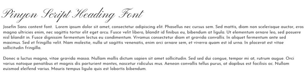
- Pinyon Script and Josefin Sans – The script style font commands attention while the Josefin sans compliments it nicely.
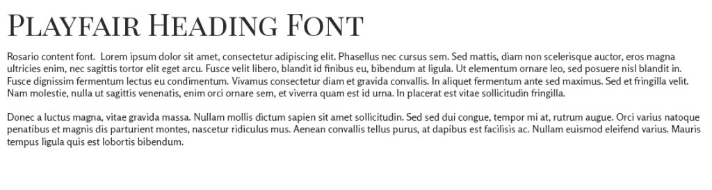
- Playfair Display and Rosario – The Playfair display works well with titles while Rosario is perfect for subtitles.
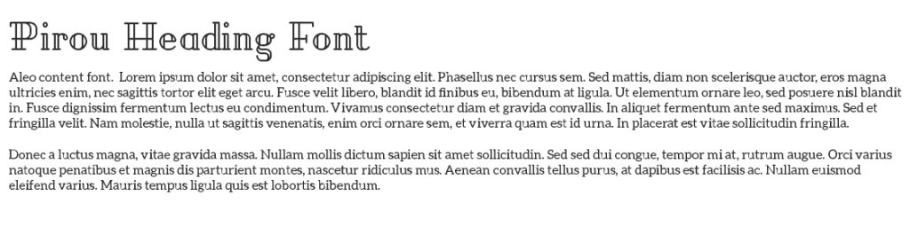
- Pirou and Aleo – Pirou stands out on any design while Aleo compliments it nicely.
Don?t use more than 3 fonts in a design
Try to stick with two or three fonts because too many of them in a design may create chaos. Keep it simple so that your website is more cohesive.
Use font families
Fonts have families, and using multiple font families adds visual interest to your website and creates a more cohesive website. An example would be Calibri Light paired with Calibri Regular. Since one font is lighter than the other, pairing the two fonts ensures there?s enough contrast to keep things interesting. However, it?s advisable to avoid pairing fonts that are too similar (fonts that don?t have enough contrast). Choosing fonts that are too similar makes it difficult for readers to establish a hierarchy.
The right font pairing is the hallmark of good web design. As a web designer, you must master the art of font pairing if you want to create exceptional designs.
Free fonts used can be found at Google Fonts and Font Squirrel.