As we know the fact that the web design world is evolving rapidly and we might have seen a lot of changes over the past few years. Something that was the goal to look forward in some point of the time was completely useless and lost all its attention in the next point of time. This is how things usually work in the web designing world. You have to keep a keen eye on the trends that come and go. It is extremely important to stay up to date with the web design trends and make your website according to it otherwise your website will loose its charm and people not visit it more than once.
Flat design got its popularity in the year 2016 and took the web designing world by storm. It was the talk of the town and everyone adapted to this change very quickly. Responsive design was another big hit and people preferred it more than anything else. So now its time to look forward to what 2017 has in store for us!
There are different web design trends that you should keep a close eye on for the 12 months ahead. There are tons of web design trends that you need to watch out for a brilliant web design which is equally loved by everyone. I am going to list down 15 of the best web design trends that you should never forget in 2017. I have also provided description and images for each of the web design for a better understanding.
Strong Color Combination
When the flat and minimal design was mostly used it the designs, web designers thought to add some bright colors to let their content shine and make it look very eye-catching. Designers tried using bright colors almost in all their designs which was a major success and also changed how the things looked.
Bold Typography
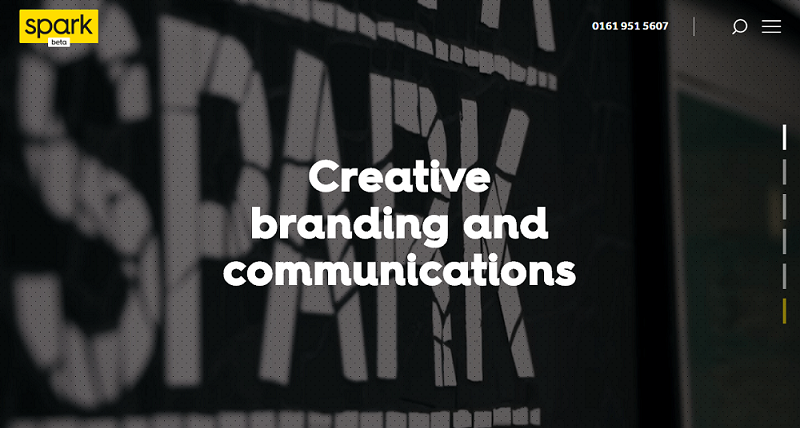
Another thing that you should be taking care of is your typography. The more old the typography is, the greater impact it has on your web design. There are many designers who like to keep their homepages refined with big and bold typography whereas the other part of the design is kept minimal and clean.
Material Design
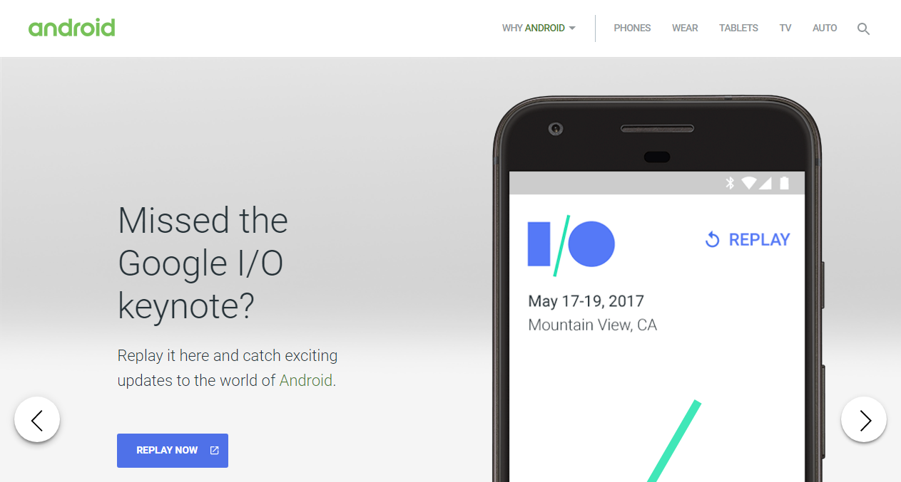
Material design has gained popularity over the past few years and is still in use like before. There are numerous designs being created with the concept of Material Design which include themes, templates, frameworks etc. It has a really creative and nice look built using the principle of paper and ink whee you basically translate their qualities into digital art.
Duotone
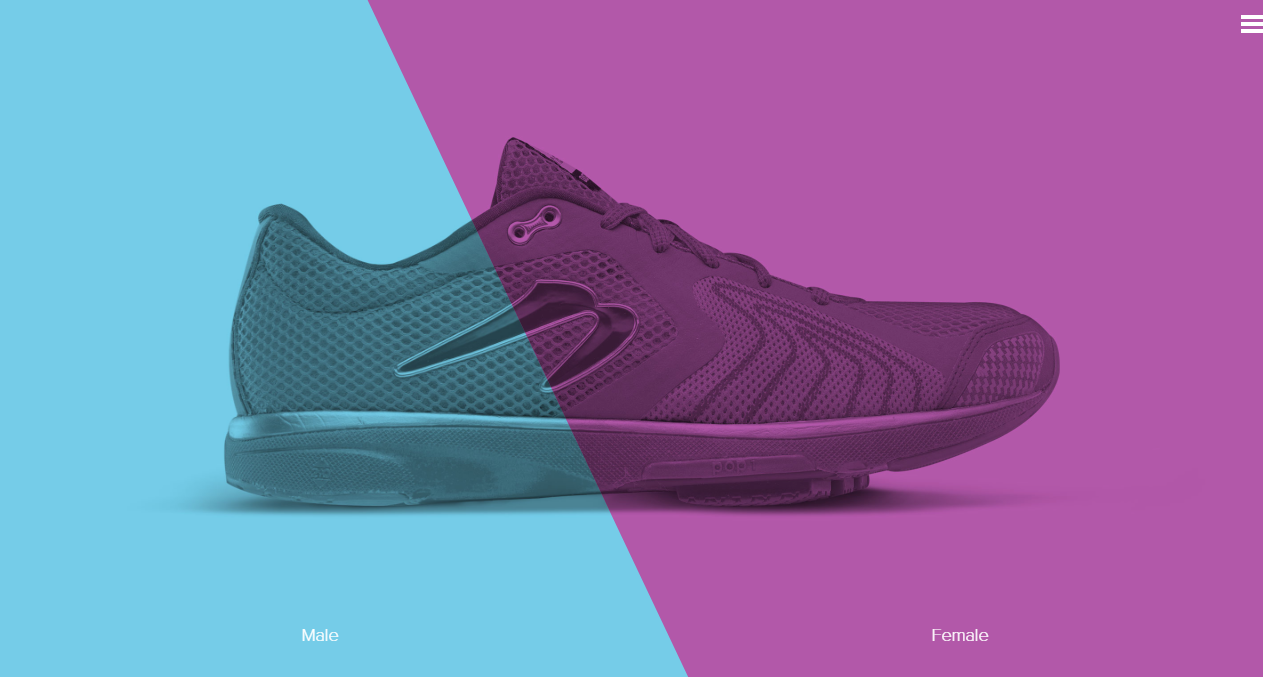
The two-tone color schemes are being used by designers to give their designs a more flashy look. It makes the web design look very creative as well as eye-catching. What happens in this design is basically there is one darker color and other is a lighter color. There are plenty of duo-tone web designs available on the internet which can help you give some inspiration to make your own two-color design.
Flexbox
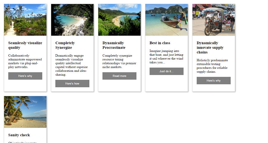
Flexbox is gaining a lot of popularity and every designer seems to be a lot more interested in this design. Mostly all the modern browsers are being supported by it whereas you will see it is more likely to be used by front-end developers for their designs.
SVG
SVGs have been in existence since a long time back but it is not really used and we still notice people using PNG and JPG file formats for their images. This SVG trend is going to be used a lot more in 2017 because the SVG images have a very small size but they render perfectly no matter the scale and also increase the speed of your page. SVG works with vector graphics only which can modify according to your choice.
Cinemagraphs
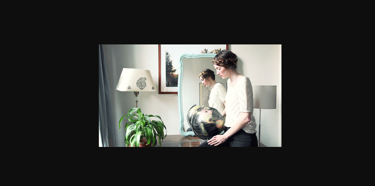
Cinemagraphs add a lot of quality to your web design content. They can be in GIF files or video format. Cinemagraphs are still photographs with components that have rehashed developments. They have been picking up ubiquity as of late, and as it should be; a well done cinemagraph can be outwardly striking. You can see different examples of cinemagraphs on the web and get to learn more about it.
Authentic Photography
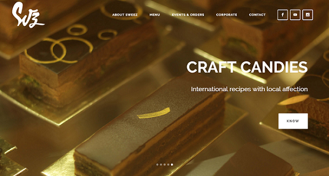
Authentic photos are extremely important for websites to let people know that they’re watching the original authentic content. For websites like online stores or any other kind of website where you showcase your work, it is important to provide your own authentic photos and refrain from copying other peoples photos which is a major turn-off for the visitors.
360 Video & VR
Anybody who is a technology geek and keep themselves updated with all the latest trends is aware of Virtual Reality which became a major hit in the year 2016 after the release of VR headsets. 360 Video trend is being used by designers in a lot of different platforms where you can easily add a 360 video into your website using Google VR View which is a JavaScript API.
Creative Scrolling
Back in the days scrolling was just used to go from top to bottom where the designers where more concerned about adding important stuff first. But with the time, scrolling and adding parallax effect has turned into another trend that everybody is following. Scrolling over is a flexible process which can work extraordinary with all assortments of substance conveyance. It works with video based substance, where extensive full screen recordings play and respite as the client looks, and also static substance, which can enliven, move, or change contingent upon the clients input.
Asymmetric Layouts
All the symmetric layout design records were broken in the year 2016 where many designers stepped out of the box and created asymmetric and broken layout designs. Asymmetrical design is the way toward making arrangements which aren’t symmetrical in their appearance and in any case, this isn’t to suggest that awry plans are uneven or disordered. Clever designers will utilize sharp utilization of space, scale and shading to make designs where components work in congruity to compliment each other.
Parallax Effect
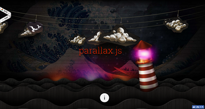
Parallax is basically a scrolling mechanism which gives a 3d impact as the closer view moves at a quicker pace than the foundation behind it. It’s an awesome visual device, which when utilized well, gives a feeling of profundity, lifting components off the screen and making a feeling of dynamism. Many companies are using this parallax effect a lot to give their website a more appealing and a creative look.
Horizontal and Vertical Text Mixing
This is a modern era where the designers are not afraid to take risks with their designs for making them look out of the box and appealing. Different designers are using this trend where they place a boring text like from a horizontal line and place it vertically with bold letter. It can be used to display something on the homepage.
Illustrations
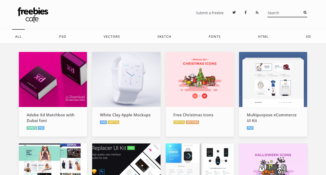
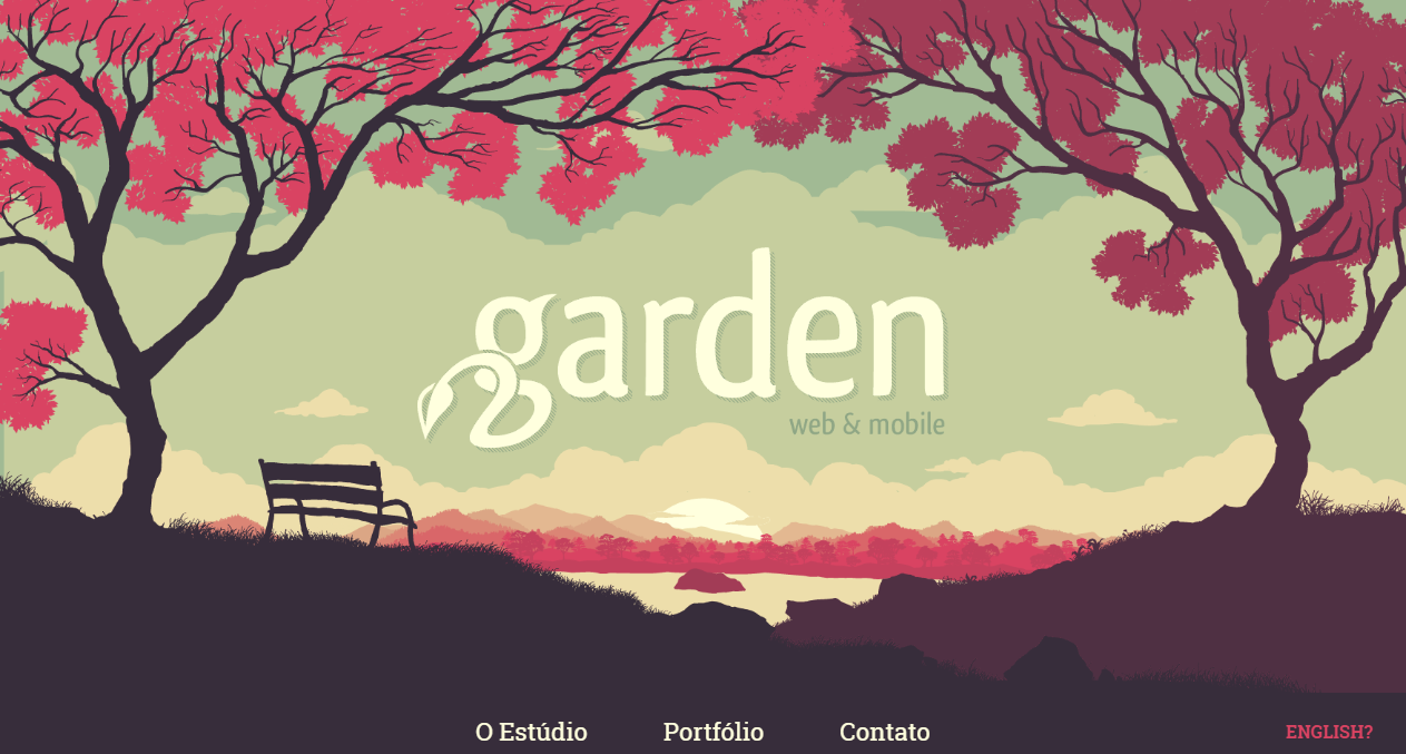
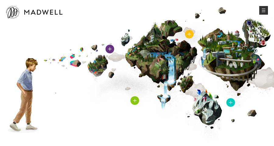
Following quite a while of minimalism and flat design, adding illustrated touches to your site is an extraordinary approach to infuse a little identity. Lots and lots of organizations are swinging to artists and visual specialists to make bespoke illustrations for their sites. This creates a great impact on the website making it look great.
Overlapping Text and Images
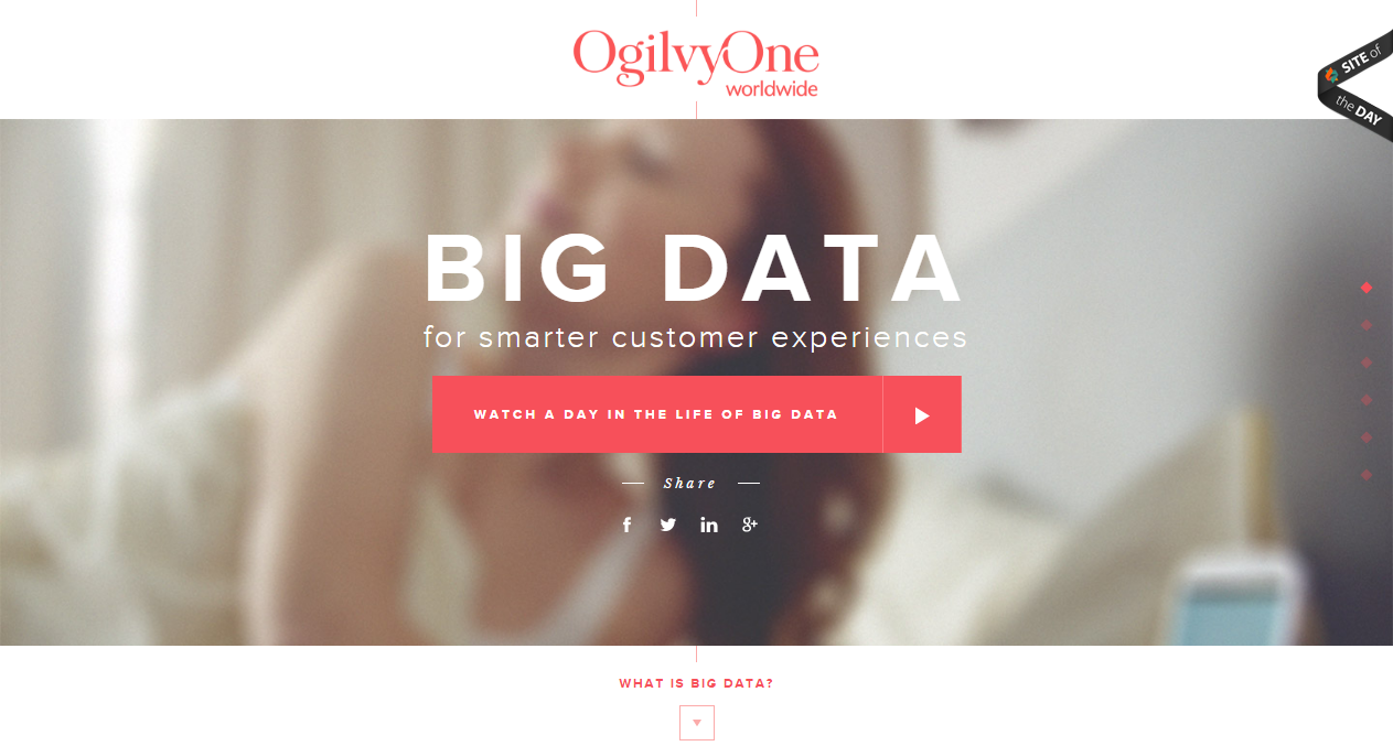
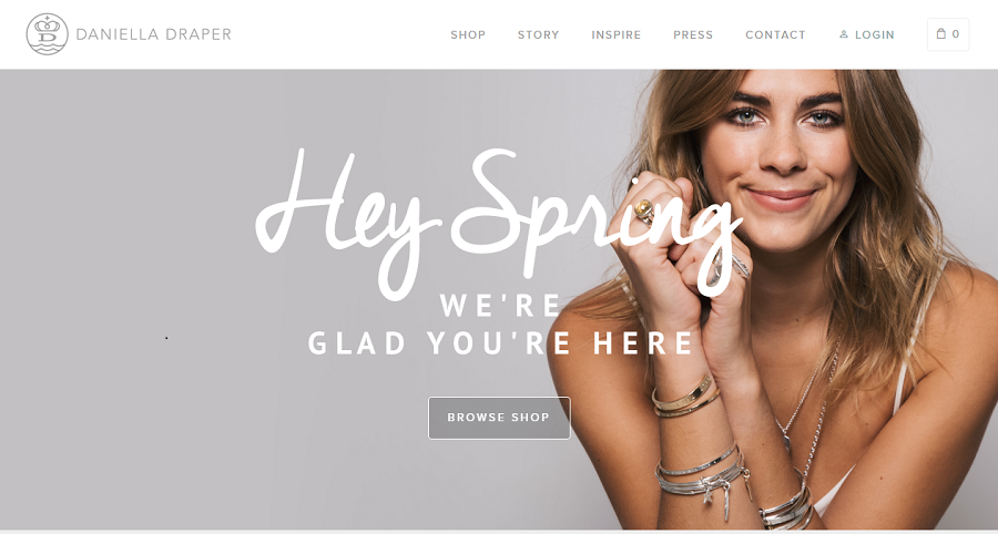
This design trend is used by designers to make a more creative looking website where you do something other than the boring usual content. Many designers are used this bold trend where you can see some text overlapping a certain image which looks great. It can be used to bring more focus on the image as well as the topic on the homepage or any other heading. It is widely used in blogging and portfolios.
