Have you ever come across a 404 error webpage on a website but you don’t exactly know what that is? 404 pages are basically there to tell the visitors that the page they are looking for is not there anymore and it can not be found on the server so, it redirects you to some other part of the website. When someone lands on your corrupt page which is not available anymore to them, it is a very annoying moment where people get frustrated and it can affect your website. So, to solve this issue a 404 error page is extremely important.
A good 404 error page is extremely important as other pages in your website. It should be able to redirect the users to the home-page or some other page without just stopping there.
If you don’t have any ideas about the 404 error page templates then I am sure after reading this article till the end you will definitely be able to create an awesome 404 error page. I have listed down 28 of the best examples of 404 error page designs for your inspiration. And, for resume templates click here.
Stickermule
We all are aware of the 404 error pages that we often get to see on some website while reaching to a specific page. These pages can actually make or break your users with their design. If you don?t have a nice 404 webpage design then your users might be affected and you could lose a lot of them.
It is extremely annoying when you see a 404 error page which doesn?t have a lot of information and just stays there without providing much information. A good 404 error page should be created in such a way that it doesn?t leave your visitors angry but instead provides them useful or funny information regarding the website or could direct them to some other page of the website.
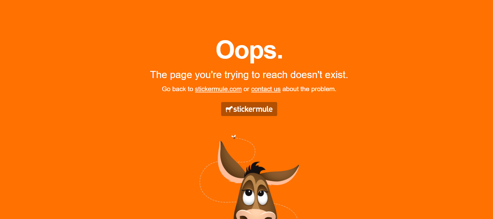
Stickermule uses a very cool 404 errorpage where you can see a donkey. They have used the colors and images in a very clever way which will make your visitors happy. It has a face of a donkey with a fly roaming above it.
iStock
We all have experienced landing on a 404 error page once in our lifetime or many times. Sometimes it makes the whole experience of using a website irritating because the 404 error page is dull and extremely boring which results in you not visiting that site again.
It is extremely important to create a cool 404 error page by using various clever tricks that will attract your customers and will keep them entertained. This is a sample 404 error page which you can take as an inspiration for designing your own error pages.
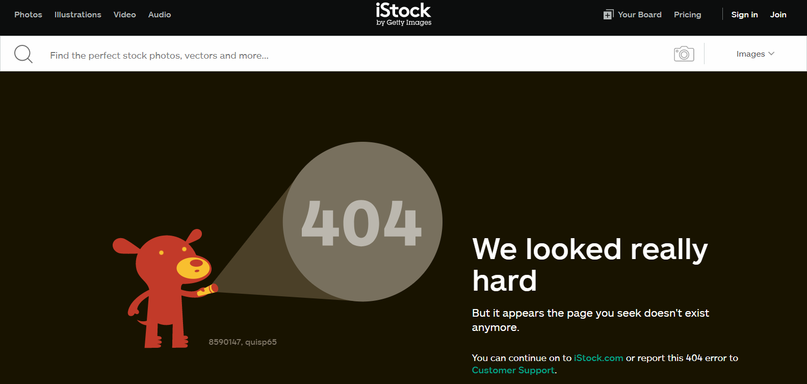
Well, iStock has created its webpage in a very cool way with some really amazing colors and custom based. You can see a cartoon character on the side which is holding a torch light in its hand. The light goes on and off on the 404 words written above it. There is also some information given on other side of the page which says the desired content could not be found.
Fuel 404 Web And Mobile Template
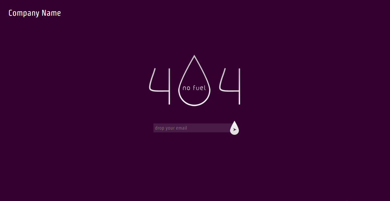
This is another 404 error page template which you can download for free and use it for any kind of website. It has a cool purple background with white text on it. It also has a very creative 404 written where you can see a droplet instead of “O’ and No Fuel is written inside it. Free Fuel 404 page not discovered layout for organization sites, Portfolio sites, and Personal sites.
On the off chance that URL is not accessible in server this format will be appeared as naturally. It?s for nothing to download web, Iphone and High-end versatile web format. In this one we are utilizing Google web fonts for textual style styling which gives cheer with new a chance to fuel, 404 portable layouts, 404 free web format, 404 smart web versatile layout.
It has a purple background with white typography which looks extremely beautiful and clean.
Gordy
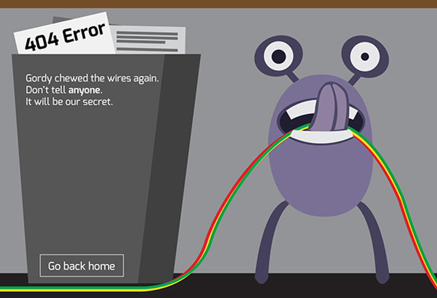
This is a very creative 404 error page where you can see Gordy chewing the wires and that is the main cause the page is not working. This website has a very creative 404 error page where you will see a purple cute little monster with colorful wires in its mouth.
You will obviously get an idea of the message which was shown through the picture. At the side of it, there is a folder containing various papers and you will see a paper sticking out of it where it has clearly been written ?404 Error?.
It also has some typography outside it which says that Gordy has chewed wires again and it should be kept a secret. What a cute way to create a 404 error page with a sense of humor. You can also see a ?Go Back Home? button which will not be as annoying as the text error pages.
Space
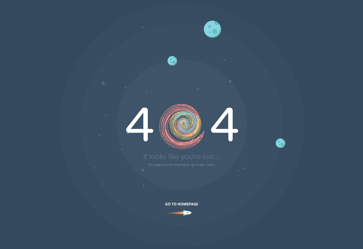
Another great example of a 404 error page where you can see creative 404 message displayed in space with a tiny rocket at the bottom with the text ?Go To Homepage”. You can also see a galactic whirl instead of a 0 which is pretty cool.
This web page has been awesomely created with the concept of space with a lot of colorful stuff. You can also see a few planets revolving around with the big block of 404 error message in the middle of the screen gaining the most focus. It has a colorful swirl effect instead of the number ?0? between both the 4?s.
It also has a faded message below the 404 which says something like looks like you have been lost; the webpage you have requested no longer exists. You can also go back to the homepage by clicking the button which is at the bottom of the page.
Airbnb
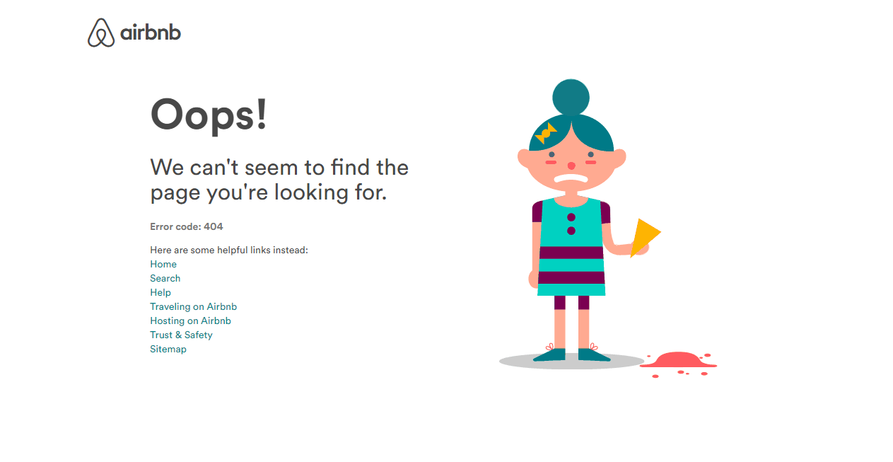
This is a perfect 404 page for the amazing website Airbnb where you can see an animation holding ice-cream all happily and then the ice cream drops. What a creative concept of using an animation in a 404 error page! It displays a 404 error message but together with that it also displays some useful links of other pages where you can go land on them just by clicking the link.
It has a lot of typography used together with the animation which will be useful for people who don?t get what the 404 error page is. It has different words used and also it says the webpage could not be found so you can get some helps from the links given below. You can click on any one of the link to reach to a specific page on the website without any problem. All the colors and the text look more good on the plain white background.
Island
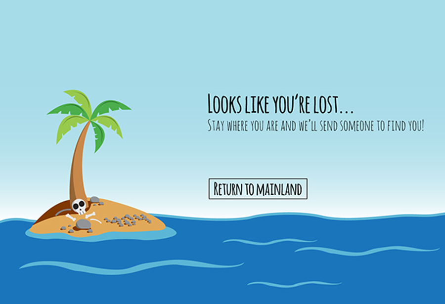
Who wants to see a boring screen which displays a simple 404 error message when you can create something cool and relate it with the situation? This webpage with the island theme looks really great. You can also go to the homepage by clicking the “Return to Mainland” button. This error page contains cutest colors and graphics which will definitely cheer you up and won?t let you go into the bad mood.
It has very cute illustrations with a nice cute message which says like you have been lost, just stay wherever you are till someone fins you. You can also go back to the main page of the website by clicking on a button below. These types of error pages don?t let the visitors get mad but they try to cheer their mood in a fun way which is a super cool idea. It has added a fun effect with picture and the fun typography.
You’re Lost
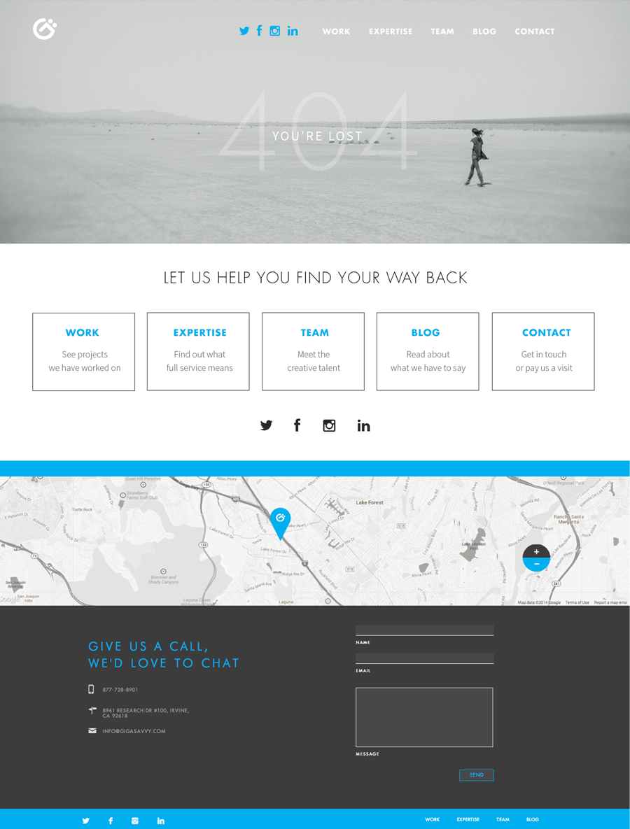
This page has a clean design but with tons of information regarding which page you want to land on. It also gives you some options to contact the team and write a message or suggestions for the team if you have any. This is a super creative 404 page with a lot of options available for the visitors through which they can gain a lot of knowledge.
This page has a background image which related to the 404 message saying you?re lost! This page is fully loaded with typography where you will see various tabs on the upper part of the screen which is mostly about the company. Below the picture you will see many options where you can go back which contains different pages of the website. These pages are inside blocks so that you can get more focus on them. You can also contact them easily by getting information from the bottom of the page.
Camera
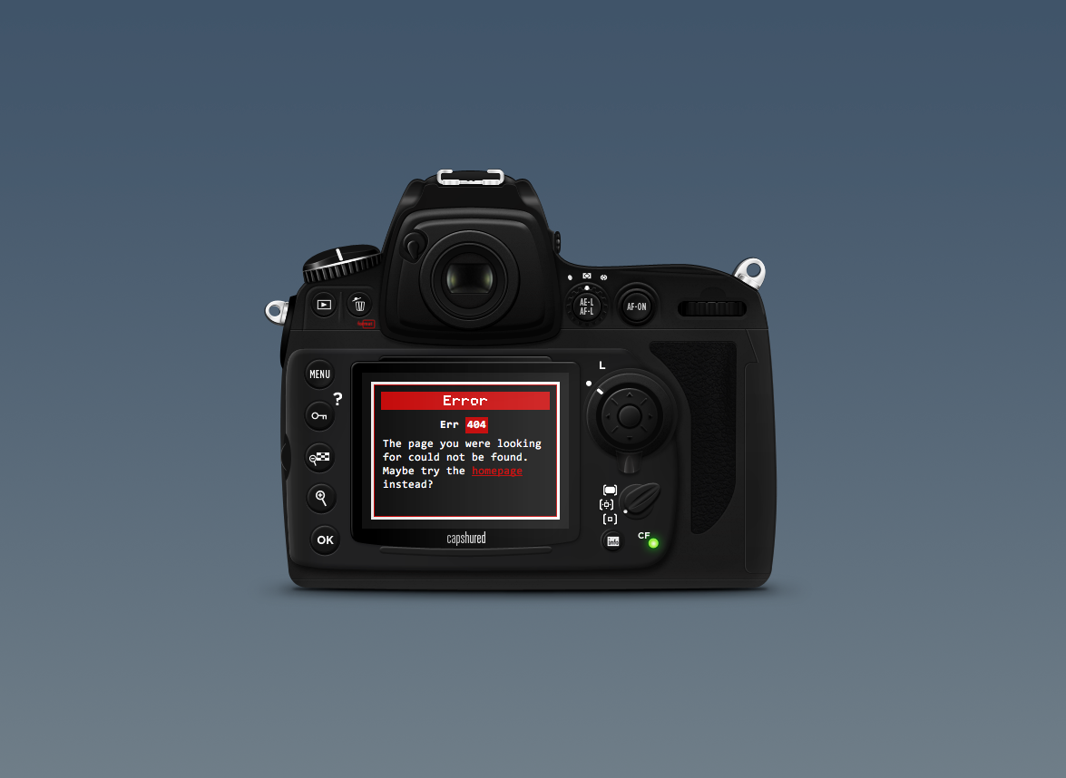
This is a very simple yet striking 404 error page where you can see the 404 error message displayed on the camera screen. It is a super creative 404 error page design which is perfect for website related to cameras or photography. It has a nice subtle background with a jet black digital camera at the front. It has all the text on the screen of the camera and not anywhere else.
You can see the text mostly in white color with a little red. The Error is highlighted in the color red inside the screen. It has a message which says the page could not be found and you also have the link to go back to the homepage.It also gives you the option to go back to the homepage. The color selection in this page is pretty attractive which would definitely engage its visitors.
Hot Dot Productions
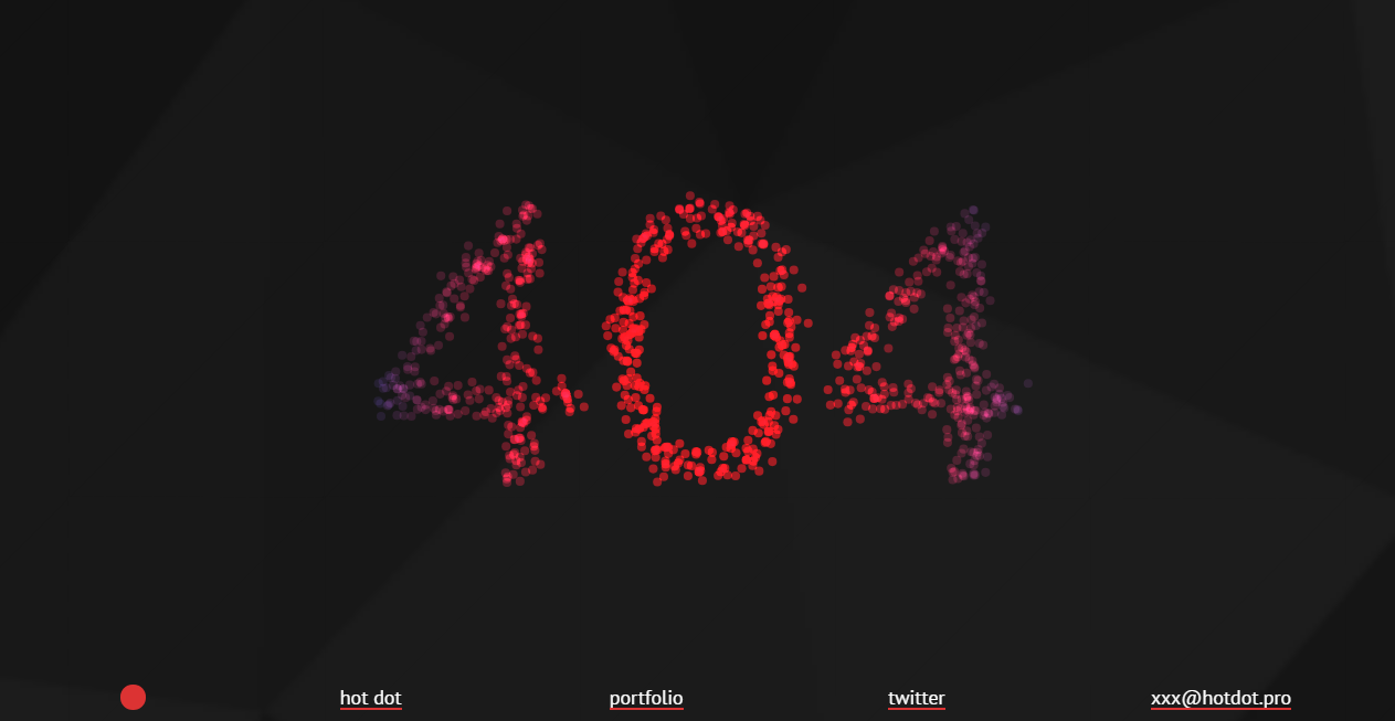
Now this is a very cool and creative 404 error page. This creative 404 error page is something out of the box which will make you stare at your screen with interest without getting mad for not finding the actual page. It has a dark black background with less typography in white and has an animation of great number of tiny red dots. These tiny red dots will move wherever you move your mouse which creates a very nice effect. You can also go to other web pages following the links given below.
If you want to contact the company, there is also an email address which is provided at the bottom of the screen together with the links of other pages. You can click it to contact them or click on the pages to go back from the current page. This cool website will not let your website lose any of its visitors.
Blizzard Entertainment
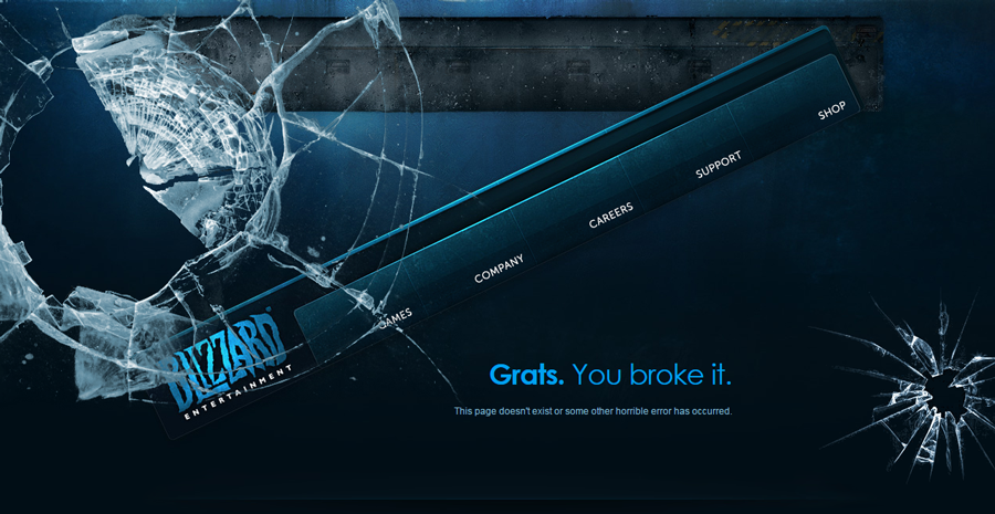
Blizzard Entertainment team have created a creative 404 error page which is the shattered version of their homepage. It displays a message “Gratz. You broke it” in a humoristic way. This page has a blue background with some bright blue typography with a combination of white color. It also has a tab which contains various pages of the website where you can click any one of them and you will land in one of those.
At the bottom of the page you will see some more text where you can see a lot of options regarding the company. You can also find the Contact Us options where you will be able to contact the team easily. You can also see some more links below the page. Overall the shattered glass makes it look really cool with different typography options that give visitors a good information about different stuff about website instead of just getting stuck at the error page.
Foxrate
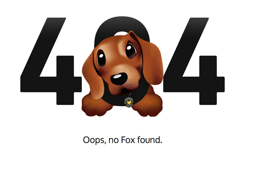
This is a very cute 404 error webpage which has a cute puppy in the middle of 404 where it is sticking its head out from the 0 part. This is one of the cutest error pages where the visitors are sure to fall in love with the cute puppy instead of getting mad for landing at the 404 error page.
It has a white background with dark and bold 404 written in the color black. The cute thing here is the puppy that is popping out from the 0 of 404 which looks absolutely adorable. Below the illustration you can see the message that says “Oops, no fox found”.
These type of 404 error webpages which are extremely simple yet display something cute with a deep message won?t let you visitors get made and you will not lose any follower of yours due to your 404 errors.
Hugo Franca
This is a super creative and fun 404 error page which displays a great message which truly matches the picture behind. It has a plate of food which is now empty as its background image and you can also see a fork with it. There?s no food left in the plate. Above the picture you can some typography in white color which displays some message.
This picture has a message which says “Sorry, we no longer have that”. So it is kind of cool how the error message is related to the food in the plate which is not there anymore and so is the page. Below that you can also see a go home button and some social media icons which once clicked will take you to the social media profiles or the home button making it easy for you. This method will also not leave your visitors mad.
Bitly
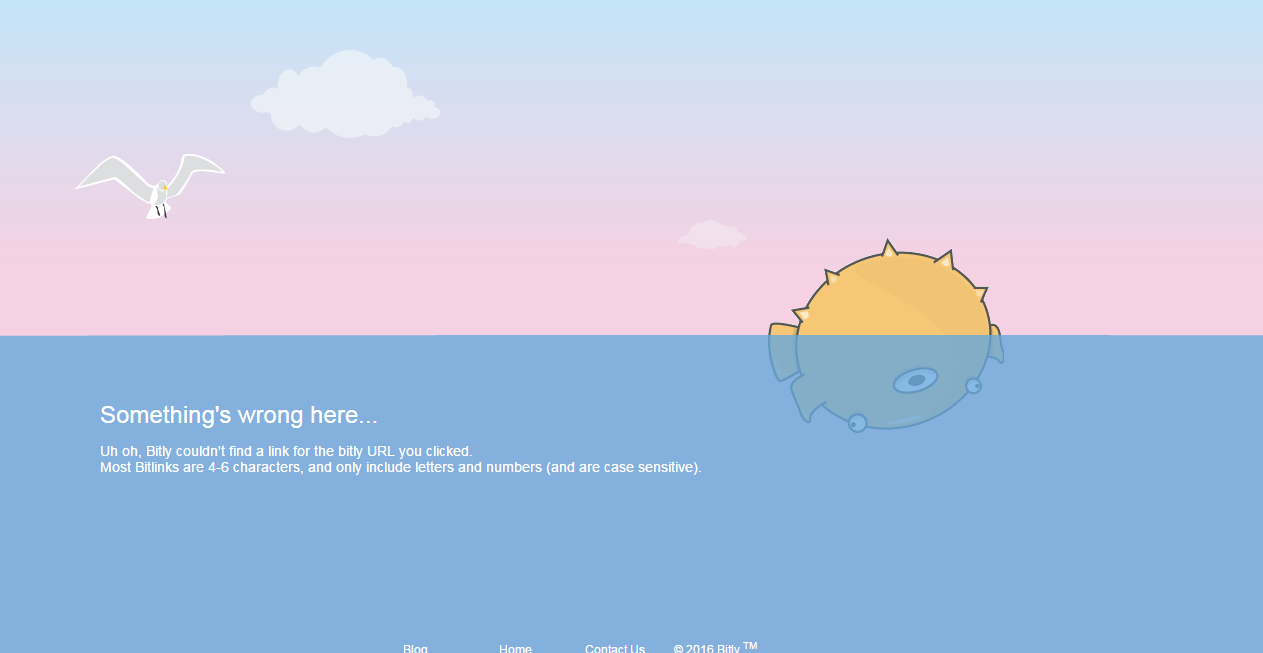
Bitly is another super cool 404 error webpage which has some super amazing colors with animations. Bitly has an animated 404 error page where a puffy fish is floating with its belly upwards. The upper half of the page is pink whereas the lower half of the page is blue which is water. You can see a white bird flying with a white cloud floating in the upper half of the page.
You can also see a puffy fish in water which is floating with its eyes in the water and its spikes out from the water. You can see a lot of typography in the blue part of the page where you will see a message which says the page could not be found. Below it you will see various links for going to various pages in the website and you can also go straight back to the homepage.
Everad
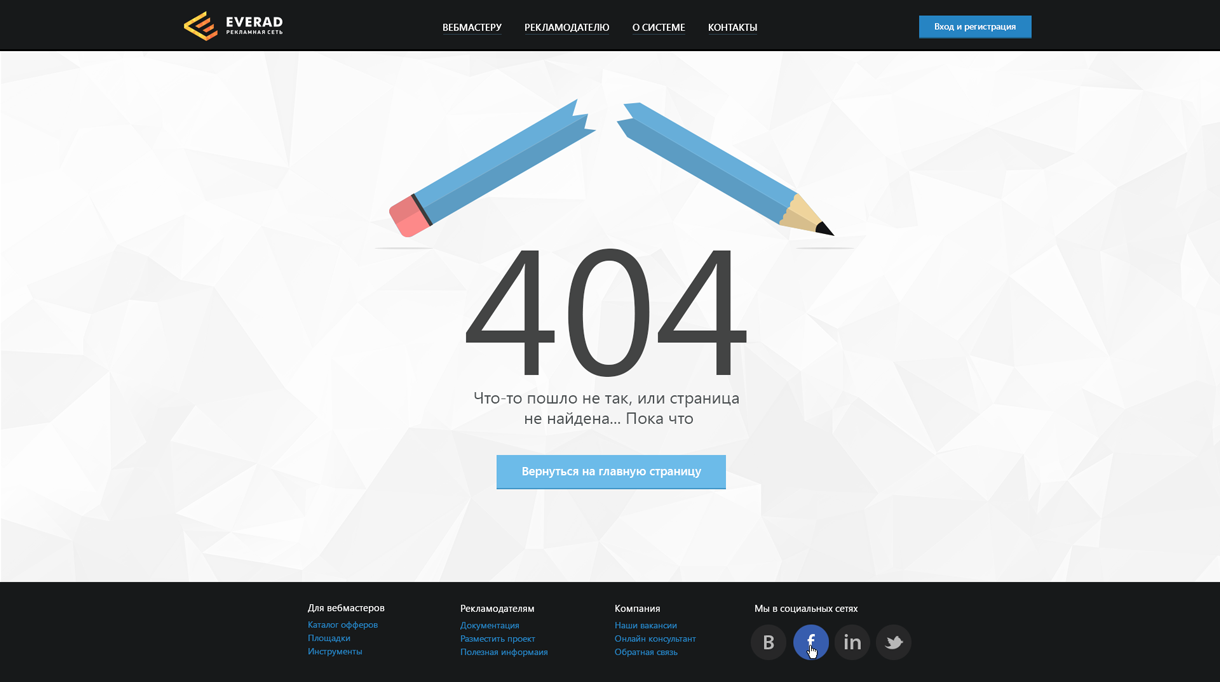
This page has a broken pencil which relates to a broken link. It has a pretty cool design with a white background and some more beautiful colors on the top which match the design perfectly. It has a 404 written in large text below the pencil which gives a lot of focus to it. It also says you can?t find what you are looking for so you have various options below.
It also contains a button which will take you directly to the main page without any hassle. Below it you can see a lot of typography where you can go to different links which have different pages or information about the company. You can also contact them by using the Contact US link. It also includes some more links to different pages and some social media icons that will take you elsewhere without making you get bored of the page.
Sad Cartoon
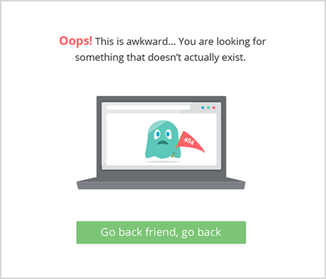
Nobody will get annoyed looking at this sad little creature on their screens. This page has a totally white background with some text and illustrations which make it pop. You can see a laptop in the middle of the screen and on the screen of the laptop you can see a cute little creature which has a triangular 404 flag in its hand in the color red. Below the laptop you can see a button in the green color which says go back friend, go back. You will be taken to the back page or the homepage of the website.
You can also see a lot of typography above the laptop which says OOPS with a red color and then it says for being awkward and the thing you are looking for couldn?t be found. It displays a message that your page has not been found. The concept of this page is very cute.
Mark Dijkstra
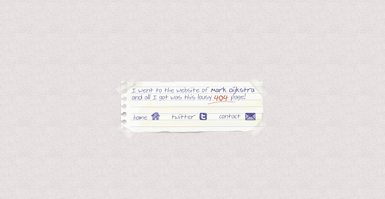
This is a very simple yet very creative 404 error page of Mark Dijkstra. This page has a plain simple background with a torn paper in the middle of the screen with a message on top of it. You can see a note like it’s a real image of a torn paper with hand-written message with sticky tapes on its four sides. It displays an error message in a funny way which says I went to the website and got a lousy 404 error page. All of this is written in the normal handwriting which gives it a very cool effect.
Below that there are three more options for you which allow you to go back to homepage, it has a social media icon of twitter which takes you there. You can also contact the team of this website by clicking on the Contact Us button present with the other two buttons.
Look It’s Me
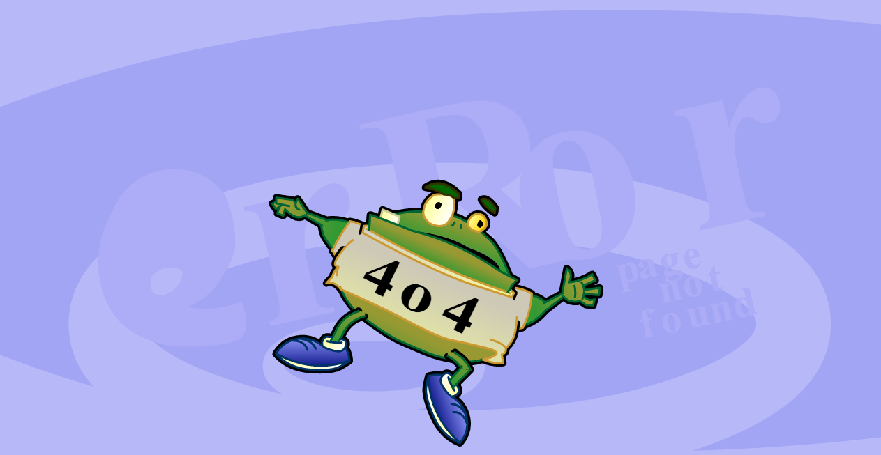
Here comes a super cool and an out of the box 404 error page. This is an animated 404 error webpage where you will be able to see some really cool animations with the sound. When you open the page you can see a fat frog wearing a shirt with 404 written on its front which seems to be falling down and down with its head below and body in the upward direction.
It has a really cool swirling background were you can also see the error written which is a bit faded. There is also text written at the back which says page not found if you look more closely. The frog is the cutest thing in this page which won?t let its visitors get mad at this page. It has some really nice color combination and cute movements which will keep them entertained. This is also a relatable situation with the webpage.
Subsign
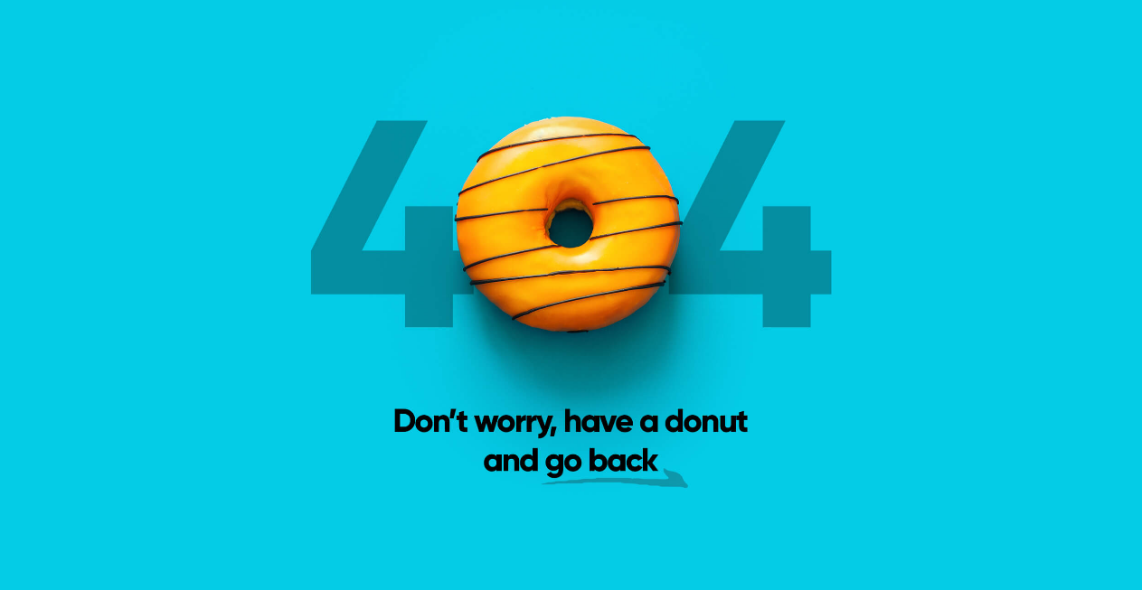
This is a super clean yet super beautiful 404 error webpage which has a perfect color combination. This page has a striking blue background and a bright yellow colored donut on top with some black typography. A colorful and eye-catching 404 error webpage where you can see a big donut kept in between the 404 instead of “0”. The donut looks extremely beautiful with bold color kept in between.
This error message will be perfect for websites which are related to bakery or donuts. You will be taken back to the homepage wherever you click on the page. It also displays a message which says “Do worry, have a donut and go back”. This will definitely grab the attention because of its striking blue color. This page is very eye-catching and it I sure to grab the attention of its visitors without letting them get mad of this 404 error we page.
Hash Rocket
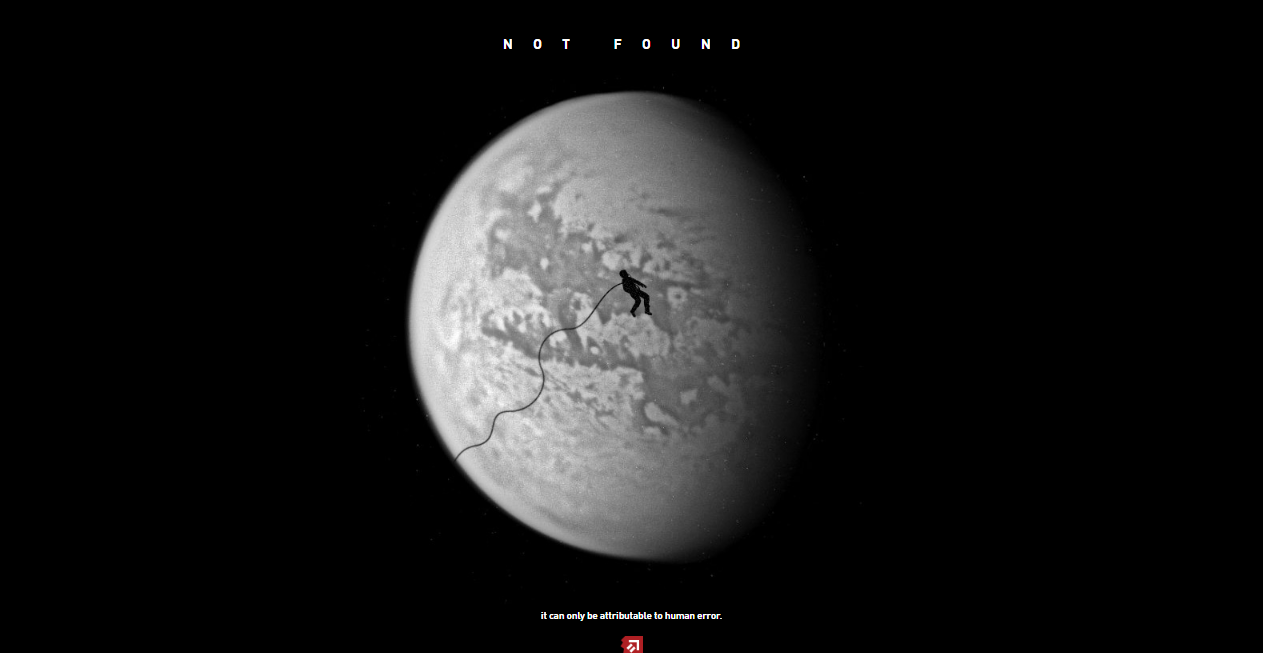
This is an error webpage where you can see a person floating in the space. This 404 error webpage is perfect for those people who prefer dark and simple pages and don?t want a lot of colors. It has a very dark background and a subtle picture of a moon in the white color and an astronaut floating infront of it. You will be taken back to the homepage instantly whenever you click somewhere on that page no matter where.
You can see “Not found” written on the top in capital letters and it also displays a message at the bottom of page which is very cool. It has a super cool design which will looks pretty decent and it will also not let its visitors get mad as you can instantly go back to the homepage by clicking anywhere on the screen without wasting any time.
Nulab
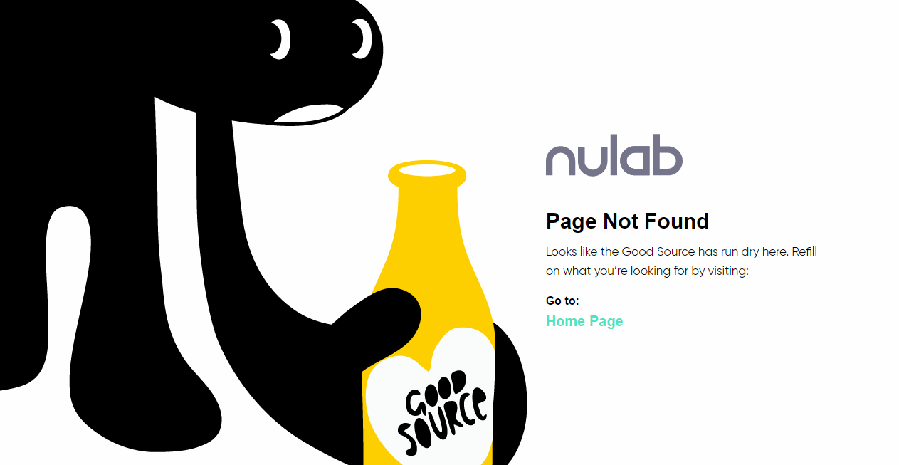
Here comes another 404 error webpage with bold and perfect colors that bring a lot of light to our design. You can see a jet black tiny creature holding a bright yellow bottle of which displays a message. The background of this page is all white with black and yellow colors on top. This 404 error page has striking black and yellow colors where you can see a yellow bottle with “Good Source” written on it.
It displays a message which says “Good source has dried out, you can refill it by looking what you are looking for by visiting” and there’s a go to homepage link below it. This is a very creative error webpage which lets you get back to the homepage instantly just by a single click. So, the visitors will not get mad because the look of the page itself is very appealing.
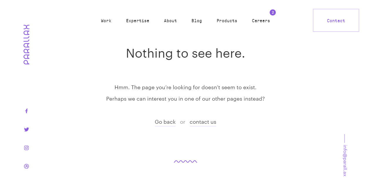
Parallax
This is a very simple 404 error webpage but also a very eye-catching one where you can see some amazing parallax scrolling effects. It has a white background with black typography and some of the typography on the side in purple color. As you scroll down and move to the end of the page the white color changes to different shades of purple.
This 404 error webpage is fully loaded with a lot of options like you can get a whole lot of information about company or you can also go back to the website. You can see message like they page you’re looking for cannot be found. You can check other pages. It has Go Back and Contact Us buttons below that message. You can also see different pages, social media icons, logo and email id creatively kept at different angles. You can click anywhere and you will get to a different page.
Good Old Games
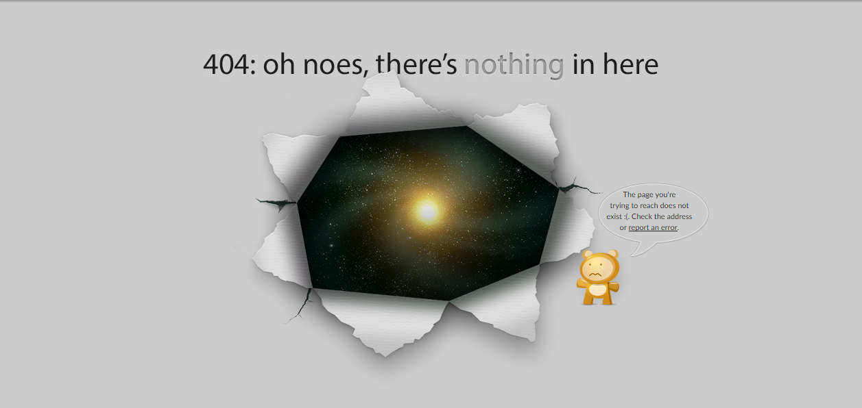
Here comes another creative and informative 404 error webpage which will not let its visitors get angry for landing a=on a 404 error page. This is a cute 404 error webpage where you can see a cute sad teddy bear displaying a message that the page doesn’t exist, you can report it or try rechecking the address. It has a white paper which is torn from the middle and you will only see a picture of the space inside it.
A teddy is standing next to it with a very sad face saying page doesn?t exist. It also has a link which says report the error and you can actually click on it and report it. You can find a lot of other pages and links below the page and above the webpage where you can click any one of them and you will be directed to a different page.
iFolderLinks
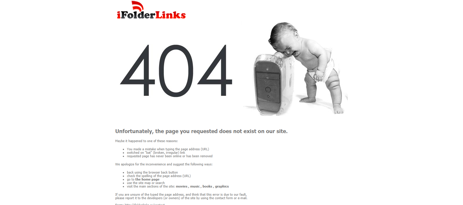
This is an interesting 404 error page where you can see the picture of a baby crying while resting his head on the CPU. The main highlight is basically on the photo of crying baby and the 404 written where you will instantly get an idea that this is a 404 error page. It has different details of text below the image which says the page has not been found.
The website page contains a lot of typography with the picture on top which gives quite a lot of information about the website for people who don’t know. The first thing that is mentioned there is why you faced the problem above. Below that are different things where you will get to know what you can do about it. You can also contact the owners by finding their email below the page. You can also go back to their other pages.
CSS Tricks
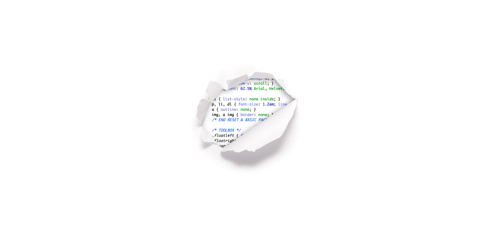
This is a very creative 404 error page which has been beautifully designed so that you can see the error in a programming language which says the page does not exist. It has a very simple white background and a coded part error page in the middle. It has an all white background with a ripped paper in the middle of the screen where you will see all the text about the error code.
The designer has very creatively used the white space o create something meaningful. This website just has some error code message in the middle of the page where it has been ripped. It doesn?t have any other typography elsewhere on the page. This is a perfect 404 error page if you want something minimalist yet with a creative message. The only problem is that you cannot go back from there or to any other page because it doesn?t has any button there.
Flat Error Page
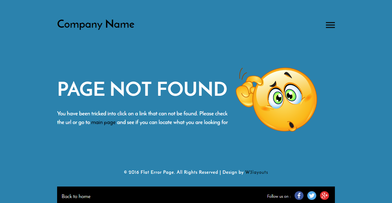
This is a flat responsive error page template where you can see a simple and a clear page with some text and an emoticon image which makes the page look cute. It has a cool enlivened expressive foundation picture that makes the penitent message sound pure to the client in addition comes prepared to use in your web ventures. The happy foundation and clear content supplement each other.
The re-coordinate route alternative is attentive and deliberate in a error page. This template is designed using HTML5 and CSS3. You can view the demo before downloading this template if you want to. You can also go back to home by using the option at the end of the page which also has some social media icons present there. The subtle background provides a very nice and calm look to the whole design making it look very clean and simple.
Free HTML 404 Error Template
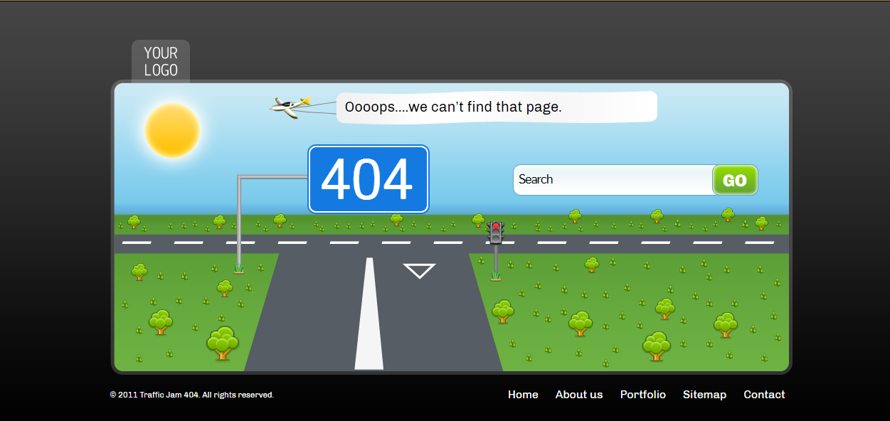
This is an amazing free HTML 404 error page template which you can download for free and also preview it before downloading it. You can see a lot of different stuff in this creative page like road, traffic light, airplane, sun, trees etc. It also has a search bar and when you write something in it, the traffic light will be yellow and it will turn green after you have filled something valid.
This is a 404 error page design by Mogoo Lab which has also made a good use of animations. You will see the traffic signal change its light color from red to orange once you click on the search bar tab. You can also easily search something in the search bar. This is a pretty cool error page with nice cute graphics that will make you fall in love instantly with the clean design of the screen.
Daniel Karcher Film
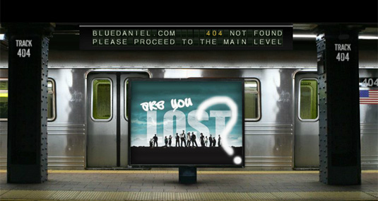
This 404 page utilizes a flawlessly rendered metro station finish with exhaust prepare that comes in. As you’d expect for a motion picture plan proficient, this site makes superb utilization of movement and sound. Its 404 page utilizes a perfectly rendered video of a metro station, finish with ‘missing’ and ‘lost’- themed motion picture blurbs and a void prepare that comes in, which you can snap to board.
At the point when your business is film, for what reason not influence your 404 blunder to page into something looking like a short motion picture? The people at Daniel Karcher completed an awesome activity with the liveliness on this page, including astute references to things like the TV arrangement LOST.
The ticker at the best flips to state “Please continue to fundamental level,” and when you click it, you’re reclaimed to the home page. Likewise with a considerable lot of the cases here, the page separates from the general site stylish to incredible impact.
GitHub
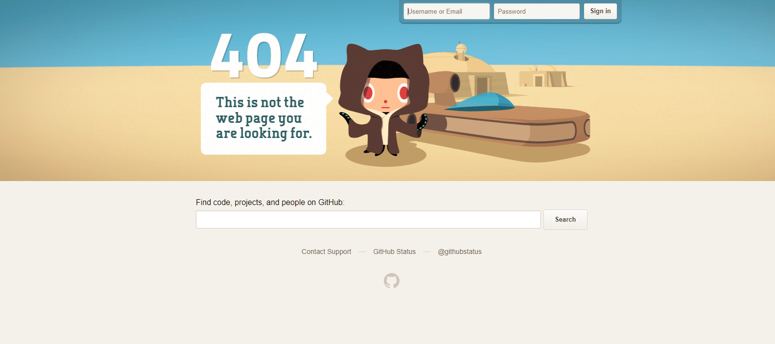
Coding site GitHub is the home of nerds, and what better approach to speak to nerds than through a straightforward Star Wars spoof with parallax impact when you move your mouse? GitHub additionally has a decent 500 page for when the server breaks.
The line “These aren’t the droids you’re searching for,” alludes to Obi-Wan Kenobi’s Jedi mind trap on Stormtroopers in Star Wars Episode IV – and it’s turned into a notable expression used to tell somebody they’re seeking after the wrong strategy. GitHub plays on this popular line in their 404 blunder message.
I extremely like GitHub’s 404 page since it offers an expansive inquiry bar. A great many people on GitHub are actually sufficiently insightful to utilize that hunt bar to enable them to discover whatever they’re searching for.
Cloud Sigma
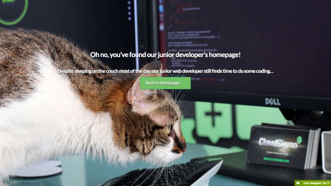
Cloud Sigma is a cloud server and cloud facilitating administration working in the US, Europe and Asia-Pacific district. While adaptable cloud servers sound valuable, they’re not precisely fun, which we figure is the reason the organization has had a ton of fun with its whimsical 404 blunder page.
I think about to what extent it’ll be before this accommodating looking junior engineer gets poached by the competition.Cloud Sigma’s giving us access on some in the background activity. Their 404 errorpage shrewdly claims to be a junior engineer’s landing page that developer being, admirably a cat!
You can take inspiration from this super fun error page which also creates a very cute funny vibe where people will not be made for landing at a 404 error page.

