Minimal design has been the trend in the web designing world since many years. This trend has been loved by people all over the world since it has come out and is widely used to create websites. Designers build their websites with the idea of ?Less is More? nowadays which leads them to making super impressive yet minimalist design websites.
Apart from the minimal design, the websites come bearing a lot of benefits like the speed of website increases, faster development, few server resources etc. The websites uses less graphical elements with more focus on fewer elements and typography options.
There are a lot of things you should keep in mind while you are designing a minimal website. You should always focus on effective typography where there should be less graphical elements. You should always keep a lot of white space or white background or any other light-colored background. You should try to use less and effective images that will make a good impression on your visitors. Another thing that is very important is choosing colors for you website. You should always choose a color that would not mess up your design and would look minimal.
Sometimes you need inspirations from other peoples work to get an idea of what you would like to make. You are always in search of some websites with minimal design which can help you in a lot of ways.
I have listed down 25 of the best websites which have a very simple, clean and minimal design and are super impressive with a little description. You can just click on the image or the ?Link? to head over to the website.
Why we Explore
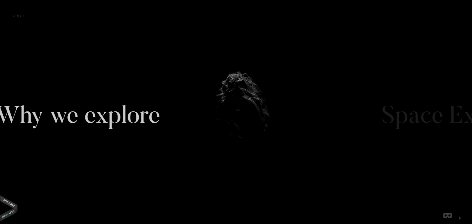
Here comes a perfect website with a modern minimalist design that is going to make you drool over its design. This website is made by the Swiss cooperation fashioner Nicolas Lanthemann, Why We Explore is a blog about space that takes after a fascinating organization.
The website consists of a black background color with white typography and moving objects over it. The scrolling effect makes this websites a hundred times more attractive. Despite the fact that the point is immense, the data is given a lot of room to inhale; each new topic being reported as the watcher scrolls on a level plane over the page.
You can scroll to next pages by clicking on the button and moving it right or left. Just keep on hovering over the screen to see lots of exciting stuff. The selection of images and the white typography makes it look eye-catching.
Tinker
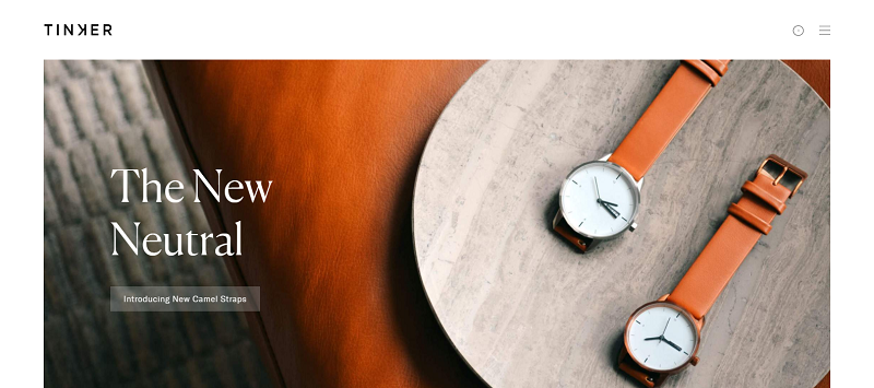
This is yet another clean and minimalist website with a very striking design. Tinker is a watch mark with a straightforward idea: clients can pick the face measure, tie shading and metal, in any blend. This website contains no pointless highlights or itemizing.
The UI for the organization’s site influences the idea to clear; clients can undoubtedly choose their optimal blend from the restricted choices accessible. It has white background with watch images at various parts that make it look mesmerizing. It also gives a zoomed in effect which look beautiful.
The menu is present at the top right corner of the page where you will be able to see various pages. You can choose wherever you want to go and what exactly you want to see without any hassle.
Another Pony
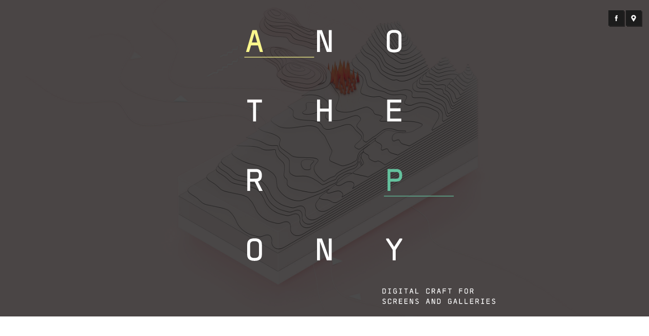
Another Pony is a website for a design studio with an extremely eye-catching design. This website was built up in 2012 and it has beautiful typography with an amazing color selection making the whole design a very minimalist yet a creative one.
The scrolling effect makes this website more fun to use. The photos are also well-organized giving it a very tidy and clean look. This website provides a great play area for computerized and customary media. Another Pony is an aggregate of three originators from Hamburg Germany. Cooperating or alone, they invest their energy making movement and stills, articles and establishments for offices, brands, science, craftsmanship and culture.
Anxious to make new visual dialects and build up their collection of capacities the studio is a place for research, tests and shared motivation. It has a very clean and simple design with amazing smooth parallax scrolling which make it more worthwhile.
Adam Andrascik
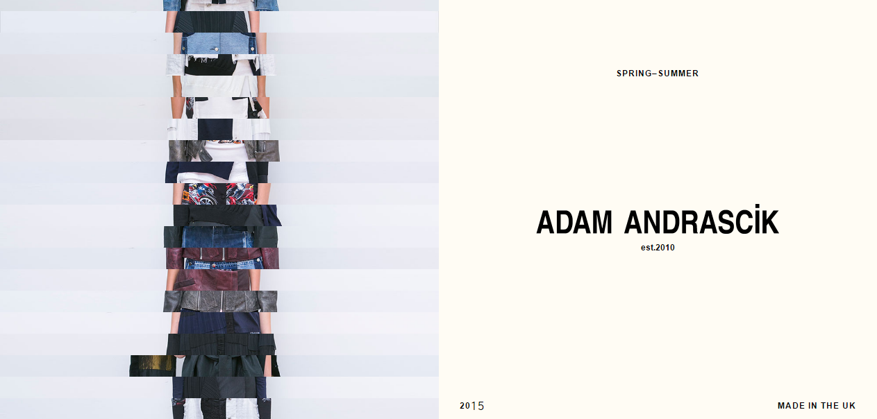
Adam Andrascik has a very cool and unique website design which is sure to make a difference. This appealing website design has a lot of whitespace and lots of cool effects that make it stand out of the crowd.
It has a white screen at one side with some information on it related to the collection and the other side has various images stacked on top of each other. The cool thing is once you hover over those images you will get to see the full images from those parts which make it quite unique.
The colors which are used mostly in this website design are black and white which complement each other. It has a very nice appealing design and is sure to give its users a nice experience while they shop. You can look for anything very easily as it provides a very organized design.
Control Films
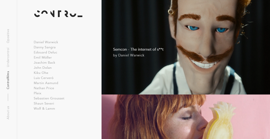
Control Films is another cool website with a striking and minimalist design where you can see full background image at the start and then you get to see different sections of menu on the left side and different project news on the right side of the screen.
When you hover over any image the video stats playing which is pretty cool. This website has a very amazing design where you will get to see a full screen picture at the homescreen with the logo on top of it at its centre.
You will be seeing it until the bar has fully loaded and after that you can see various categories and a lot of different images once you scroll down. There are also some videos at the bottom once you keep scrolling which also add a lot of appeal to the design.
Leen Heyne
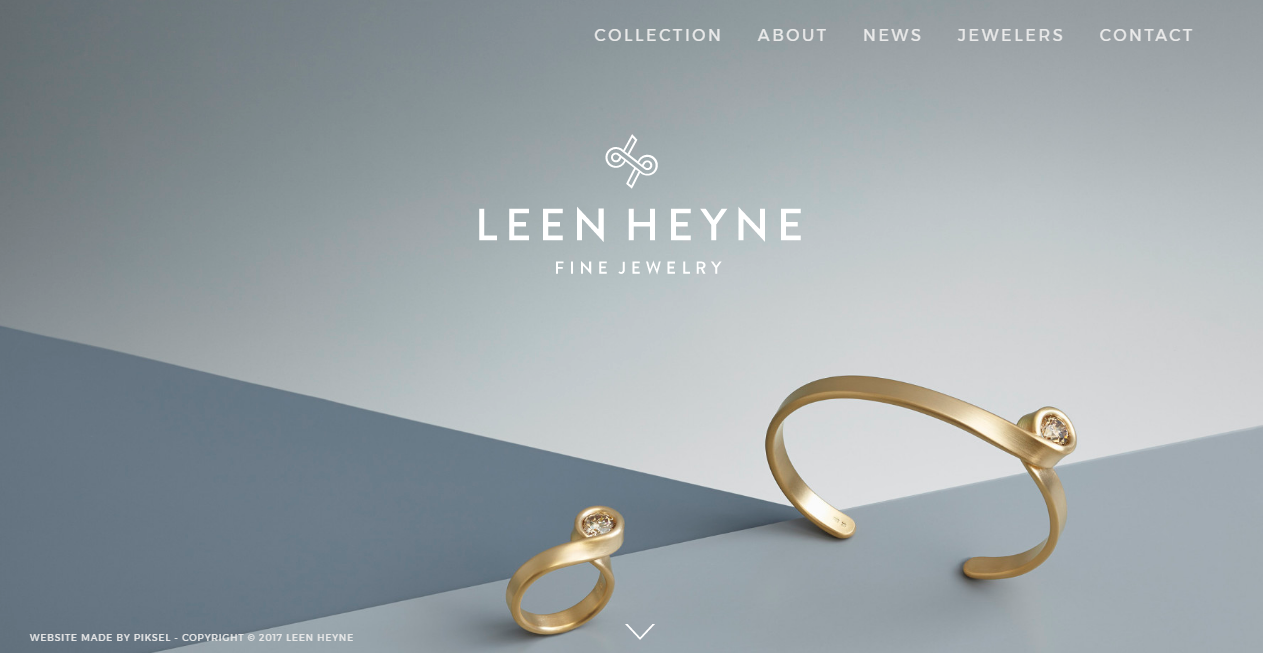
Leen Heyne has a very minimal website design where you will be able to see only the logo name and some jewelry pieces. You can browse the designs by just clicking the arrow button where you will see the specific products picture with a dark and light grey background.
This website has an amazing selection of colors which look very pleasing to the eyes and provide a super amazing design. This is a one page website design where you can see a full background image covering the whole screen.
You cannot scroll down but once you click the arrow below you will be taken down and there you will have various pages which you can keep on checking. There is also a menu bar at the top of the screen in white color which makes it pop. You can slect any option from menu to move to another page.
The Lead Agency
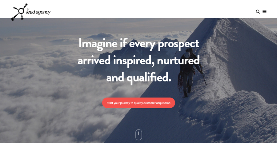
This website has a simple and clean design with beautiful typography. You can see a full width background image with some typography. As you go downwards, you will see more stuff which is organized in a very clean manner.
This website uses a lot of white color in its design which makes it look more clean and interesting. The full-width background image looks very striking and also gives you information about the website. It also has a menu button at the top right of the screen which once clicked will list the various pages of the website where you can select any one of it.
As you scroll down you will see a lot of different information about this website or the company about what they have to offer. You can see all the specifications of this website and also what they offer.
Nahel Moussi
Nahel Moussi is a portfolio website which uses different techniques to keep its design attractive. It has featured image sliders with the name of project on them and just one button at the top right above the images. This website has a super cool design which is sure to grab a lot of attention.
This website has a very eye-catching design with white background and lots of images sliding in here and there. These images are mainly from the albums of the photographer which once clicked will take you to the whole collection of that specific album.
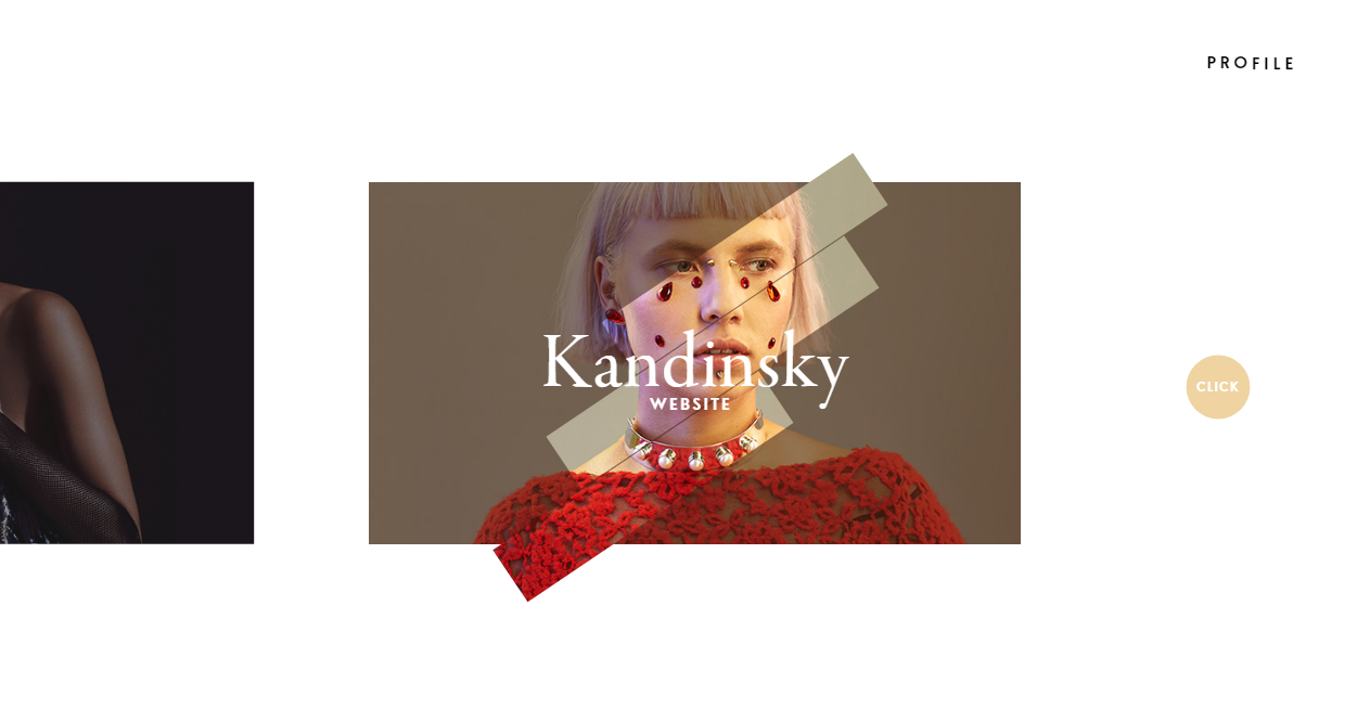
The more amazing thing about this website is that it can actually take you to another page which has a totally different color than the homepage and it will give a whole new look to the design of the website. You can check out profile too containing various items.
Lars Torn?e
Lars Torn?e is a furniture and store design brand which has pretty creative website containing different images of items from the store in a perfectly organized way on homepage. It also has a menu on the top right and a logo at the top left.
You can click on the picture to further explore its description and minimal design. This website is all about the whitespace design which makes it look more stunning. It has images of various items from the store which don?t really have a fixed size.
It uses two colors the most and they are white and yellow. When you hover over an item or image you will see a yellow color appear with some information about the items which once clicked will take you to its whole collection. There is also a menu bar at the top of the homepage where you can select any one of the buttons to go to some other page.
Faculty
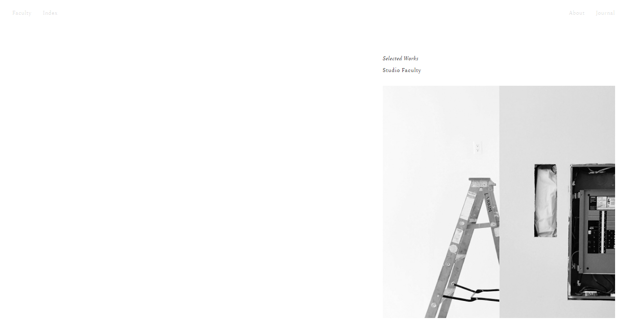
Here comes a website which has a very minimalist design where you will see a lot of white space. It only has some elements on its homepage with image on the right side. Once you click the image, it will take you to another white-spaced page containing different elements.
This website has a lot of whitespace in its design which makes it look very clean and simple. The whole page is white with tiny typography on top and some images on the right corner of the page. Once you click on the image you will be taken to another page where you will see a lot of categories which have a detailed description and you can select what you want to see next.
It also has some buttons on the top of the screen at sides which can take you to other pages of the website.
Matt Assez
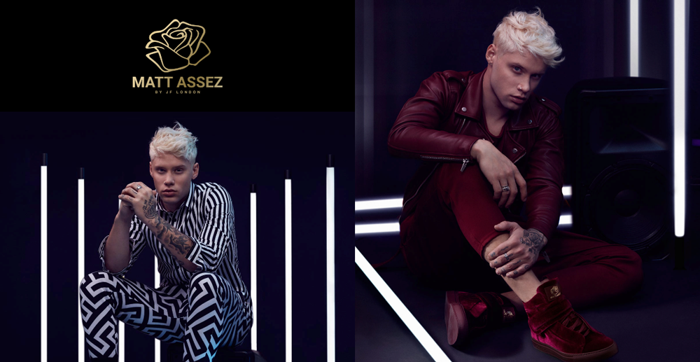
Matt Assez is a leading sneakers brand website with extremely beautiful and minimal design. You can only see some large images and brand logo on the home-screen where some text appears over them if you hover.
You can just click on the image and the description about that specific product appears. It also has some beautiful sections for typography. This website has a homepage which is fully covered with fur different images which are stuck to each other making a beautiful classy background.
The color combination is extremely beautiful mostly black with white typography above it which lets it shines. You can click on the image to discover the items that it has and there you can choose what you like. There are various items with description once you click on them and then you can shop according to your choice.
AYR
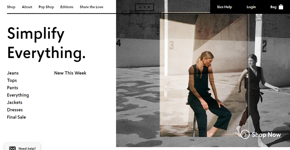
AYR is a clothing website which stands for All Year Round and has a minimalist and an eye-catching design. You will see a featured image with some typography elements on the website. You can click on the options you want and it will direct you to another page.
It has white background on the typography part. Established in 2014 by a group of angels who trust great outline has a place with everybody, for regular day to day existence, AYR remains for All Year Round. This website also uses whitespace and uses a lot of black color in its design which makes everything look prominent and a lot more striking.
The use of images in this website is extremely creative and very eye-catching. It uses a lot of information and typography which you can click on to get to that specific content.
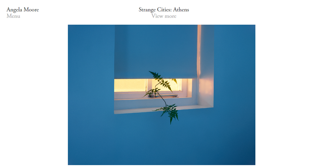
Angela Moore
Here is a website Angela Moore where you will see quite a lot of white color on the homepage and a square image on the middle on homepage. It comes with a really clean design where you can select from the typography elements which will lead you to other pages. This website is definitely for people who don’t want a messy design.
Angela Moore accumulations of hand painted adornments, resort designs and home accents are based around making ordinary living a workmanship. The Angela Moore gathering highlights hand painted, beaded gems, resort styles, bright adornments and home stylistic theme items.
Angela Moore plans incorporate smash hit, hand painted adornments in topics motivated by most loved hues, fun patterns and causes we think about. The website design makes this website look more amazing. It uses the whitespace concept and when you scroll down you can see the images from left coming up.
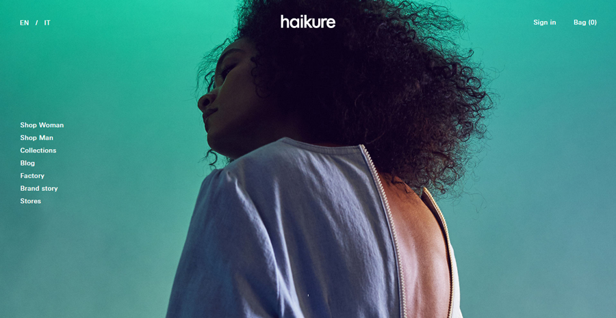
Haikure
Here I present to you a website with a minimalist design but looks extremely impressive. It features a full-width background image which will definitely grab visitor?s attention. There are also some menu categories on the left sidebar of homepage and a little menu bar at the top right with tiny typography.
This beautiful website is all about the images and the parallax scrolling effect which makes it more amazing. The website has striking full width background images till the bottom of the screen which gives it a very unique and cool look. This website has a very clean design which doesn?t look messed up with all the typography.
It has a menu bar at the center left of the screen where you can choose what you want to see next. You can also Sign In or Shop easily just by clicking n the button present on the top right corner.
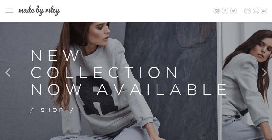
Made By Riley
Made by Riley is a chic website where you can see different full-width slider images from the latest collection of this store. It has some icons on the top right above the images and a logo and hidden menu on the left top which appears with a great effect once clicked.
This is a website which is very eye-catching and it definitely is going to attract a lot of customers without making them feel irritated or bored. It has a full-width featured image slider which makes it more striking. This website also has a very smooth parallax scrolling which makes the experience more amazing and you can actually shop with great ease and fun.
The design is based on whitespace which makes this website look more amazing and the content is clearly visible. It also has a menu on the top left of the screen which gives you all the categories once clicked.
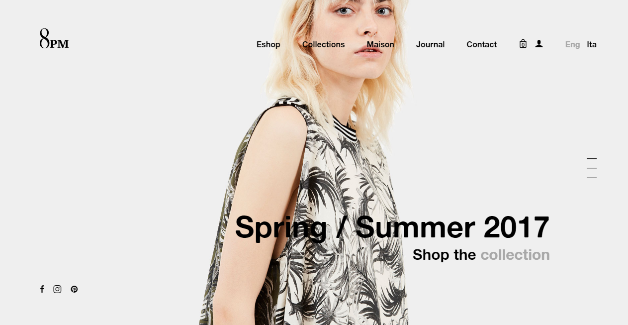
8PM
8PM is a clothing website which has a very classy design to keep its visitors hooked to it. You will see full background featured images slider on the homepage. You can also see the text written above the pictures which says the latest collection.
It has a clean menu, logo and design which gives it a clean look. The full background image makes this website a lot more appealing and it will definitely keep your users engaged with its beautiful design. It has various pages on the menu bar that you can see above the image and you can click on any one of them to go to the category you want to shop from and have a look at.
It has a smooth parallax effect which doesn?t let your content get stuck. There are also various collections down below with a picture that you can choose from.
Refinery29
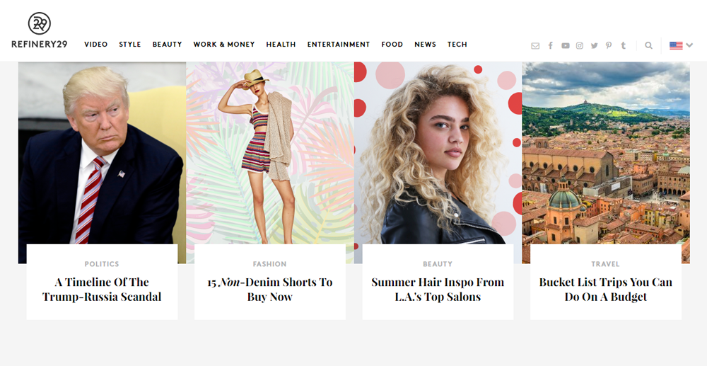
Refinery29 is another perfectly organized website which has a minimalist yet modern design. It has different categories of stories for you with images and a little description. There is a lot of white space background. It has some social media icons and a menu bar at the top which will further provide you with drop-down menus once you hover over it.
This is a website which makes a beautiful use of the whitespace where you can actually see the content that is there. You will get to see a menu bar at the top consisting of a lot of categories related to the website.
You can also see the top stories below which lead you directly to the content you have clicked on. It has various topics from different categories on its homepage as you scroll down and you can click on any of them to go to that specific category.
Callens
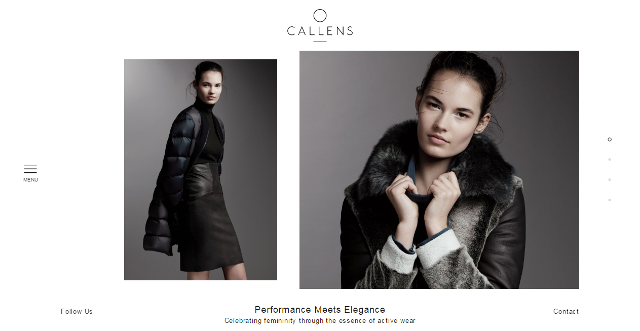
This women’s clothing website will give you a fresh breathe of air with its white background all over. You can see some stunning images which pass over each other when you scroll down or up the homepage.
The website only contains a beautiful logo in the middle of page and menu bar at the left side of the homepage which makes it look very trendy. It is a website which has makes a great use of whitespace. This design and look of this website is simple and clean yet very striking which lets its content shine.
It has a menu bar button located at the center of the left screen which once clicked will display you a lot of categories from this website where you can go to the one where you want to shop stuff from. It has a very organized look and you can find out anything easily.
Bulgari
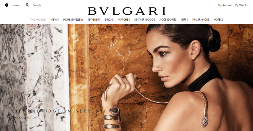
Now who is not aware of the amazing and super popular brand which is loved by everyone all over the world? This leading Italian brand which is famous all over the world for its products has some amazing minimalist framework making it eye-catching.
You will see a menu bar which contains all the categories of elements present in this website. The homepage features a full-width image and below it are different images of products from different categories. It also carries a white background making it look neat.
It has a super beautiful design where you will see a full width background image at the homepage from the latest collection of some category they sell. Below it you can see some products from various categories where you can just click on any one and you will get to see a whole collection.
Erminando Aliaj
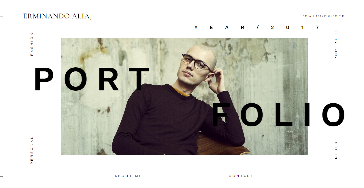
This is another great website with some very impressive techniques which also has animations when you open the website. You will only see featured images which change on the white background that makes it look super attractive. There are also some typography elements written here and there.
The beautiful and striking photo at the homepage will leave you in awe and will make you want to see more of it. It has an image slider where the first one has a super creative photo where you can also see something written above it in a creative manner. Another photo is of the photographer who owns this website.
There are also photos from his work which you can click and you will be directed to that specific collection. You cannot scroll down anywhere because everything is present over there and you can see it in a very creative yet organized manner.
Margaux Gayet
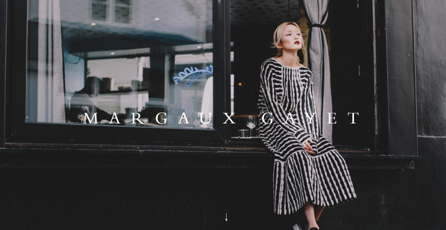
This super stunning website has a very minimal design where you will see a full background image and a logo on top of the image. There is absolutely nothing else on the homepage. When you click anywhere on the picture, you will be directed to a new page containing different typography section and image section.
It has a very eye-catching design which will keep your users engaged and won?t let them get bored. When you open the website, it has a full background image fitting the whole page with text on top of it.
After that you will be able to see various images which keep changing on the right side of the page and a lot of categories or tags on the left side of the page which don?t change. You can also see three buttons for going to various ages on the top left of the page.
Vietti
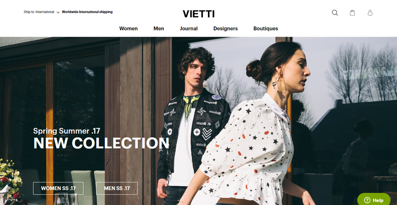
Vietti is a super amazing website which provides you with lot of information but a minimalist design. It is so appealing to the yes where you will see a full-width featured image and some typography sections.
It has a white background and when you scroll down, you will see some more stunning images from their collection. The color selection together with the typography and images gives this website a complete look which can attract a lot of customers and provide them a great experience. It has a large image at the homepage where you will see promotional stuff related to the website.
Below it you can actually discover the outlets and some of the shoe collections which are really trending. Al the categories that you can shop are present below each other on the homepage when you scroll down which makes it easier for you to choose from.
Nike
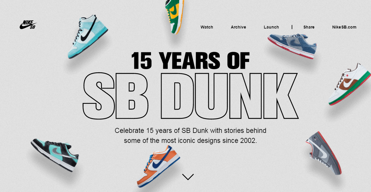
Here is another example of a super cool and super famous website which is known all over the world for their amazing products. This website comes with super techniques to make this minimalist design a very appealing one to the visitors.
It is a leading sneakers brand all over the world. When you open the homepage you will see some text written where it is surround by different sneakers which movie according to your mouse cursor movements. It also has a menu bar and when you go down you will be able to see a video.
It has a very clean design where you will get to see a lot of different large pictures from different shoe collections. There is also a video when you scroll down which can be played by clicking on the play button. It has various shoes below in masonry grid format which makes it easier for you to choose from.
Spectacles
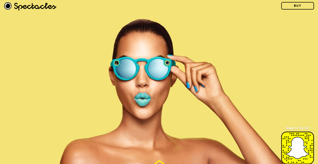
Here comes a very cool spectacles website which has a full-screen featured image slider with gorgeous images of different models wearing the specs. What you would see above the picture on homepage is a Snapchat icons the bottom right of image, logo on the top left and Buy option on the top right of the image.
When you scroll down you will see the description and specifications about certain spectacles. This website has a super cool design with bold and eye-catching colors. It doesn?t have a very crowded menu infact it only has one button at the top right of the page where you can go and shop.
Once clicked on that button it will take you to the bottom of homepage where you can shop for your favorite stuff and choose from different designs., At the bottom of the page, you will also see a video which bring more appeal to the design.
Natan
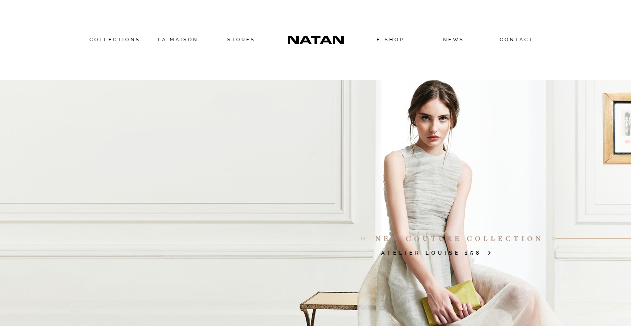
This is a clothing website which has a stunning web design with minimalist typography and design. You can see full-screen featured image slider on the homepage with some tiny text written over them. This is a very eye-catching theme which is also very informative. Once you scroll down, you will see different items from the store. This website has a super cool design which will definitely get you all involved it its design. Natan is a fashion house established by Edouard Vermeulen. It provides jazzy and contemporary fashion design to ladies.
This website consists of various pages together with a lot of images which provide a very cool look to the design of it. It also has a sound when you open the website with featured image sliders that look really amazing. It has a parallax scrolling effect with various images that will make you want to explore more of the stuff from that collection.
It has very nice subtle colors followed by a simple and clean design that will get you hooked to it. You can click on any other page where you will see the images are very amazingly organized and you will not see any messy look.
